
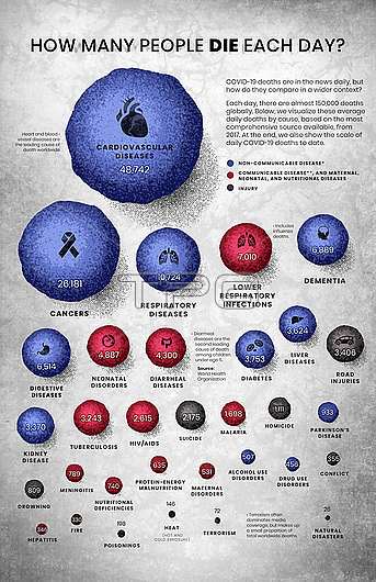
Infographic illustration depicting daily cause of death around the world. The number of deaths per day is indicated by the relative size of the spheres. Blue spheres correspond to non-communicable diseases (e.g. cancer, heart attacks, stroke etc) , red spheres correspond to communicable, neonatal and nutritional diseases (e.g. influenza, HIV/AIDS, malaria etc) and grey represents deaths through injury. Nearly 150,000 people die each day. Cardiovascular diseases are the leading cause of death globally. The second biggest cause are cancers. Based on 2019 figures from Our World in Data.
| px | px | dpi | = | cm | x | cm | = | MB |
Details
Creative#:
TPG33842844
Source:
達志影像
Authorization Type:
RF
Release Information:
須由TPG 完整授權
Model Release:
n/a
Property Release:
n/a
Right to Privacy:
No
Same folder images:
 Loading