
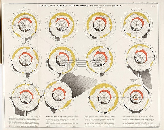
Graphs showing the relationship between the mean temperature and the relative mortality rate of London, UK, from 1840 to 1850. The 10 year average is at bottom right. Every other circle represents one year and is divided into 52 weeks. The concentric circles represent increments of 100 deaths and 10 degrees Fahrenheit. The outer black shaded areas show the extent by which the weekly deaths exceed the average weekly deaths, and the yellow shaded areas the extent to which they are below average. The inner red shaded areas show the extent by which the weekly mean temperature exceeded the average weekly temperature of the preceding 79 years, and the inner black area where it was below that average. The cholera epidemic of 1848-1849 can be clearly seen in the increase of excess deaths. From Report on the mortality of cholera in England, 1848-49, by William Farr (1952).
| px | px | dpi | = | cm | x | cm | = | MB |
Details
Creative#:
TOP28868131
Source:
達志影像
Authorization Type:
RM
Release Information:
須由TPG 完整授權
Model Release:
n/a
Property Release:
n/a
Right to Privacy:
No
Same folder images:
 Loading