
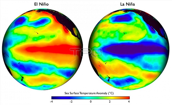
Every wonder why the Sea Surface Temperature (SST) map patterns of all El Ni簽os look strikingly similar to the Sea Surface Temperature map patterns of all La Ni簽as? The reason these two supposedly different climate events look and act so similar is that they are actually not separate events, rather they are one geologically induced and continuous event. An event that is generated by a massive pulse of fluid flow from a major deep ocean fault zone located east of the Papua New Guinea/Solomon Island region. These events have striking similar overall map pattern shapes, especially the long, linear, wedge-shaped pattern that dominates the center of both images. Both wedges have a narrow-pointed western shape and a more fanned-out eastern edge. The maps have different color schemes, warmer red colors/El Ni簽o map and cooler blues/La Ni簽a, however this is just a relic of a cooling magma chamber. The key is matching and interpreting the meaning of the map patterns shapes.
| px | px | dpi | = | cm | x | cm | = | MB |
Details
Creative#:
TOP22095679
Source:
達志影像
Authorization Type:
RM
Release Information:
須由TPG 完整授權
Model Release:
N/A
Property Release:
No
Right to Privacy:
No
Same folder images:
 Loading